Rebranding World Bank's Digital Public Infrastructure Program
In 2025, I led the rebranding of the World Bank's Digital Public Infrastructure program — unifying two flagship initiatives helping governments deliver digital IDs and direct payments to people who need them most.
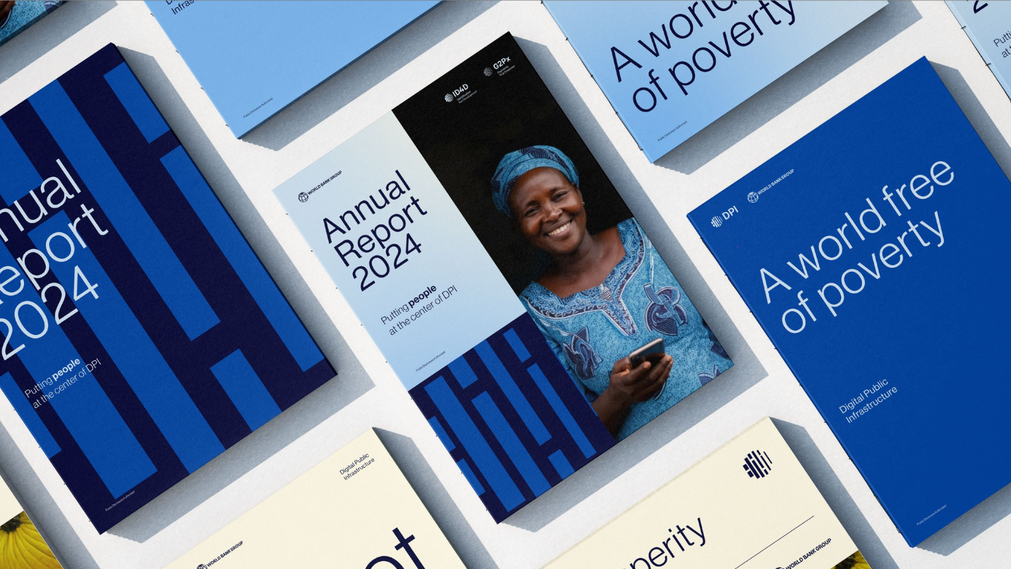
We redesigned the entire visual identity.
We derived the DPI logo from the World Bank global logo.
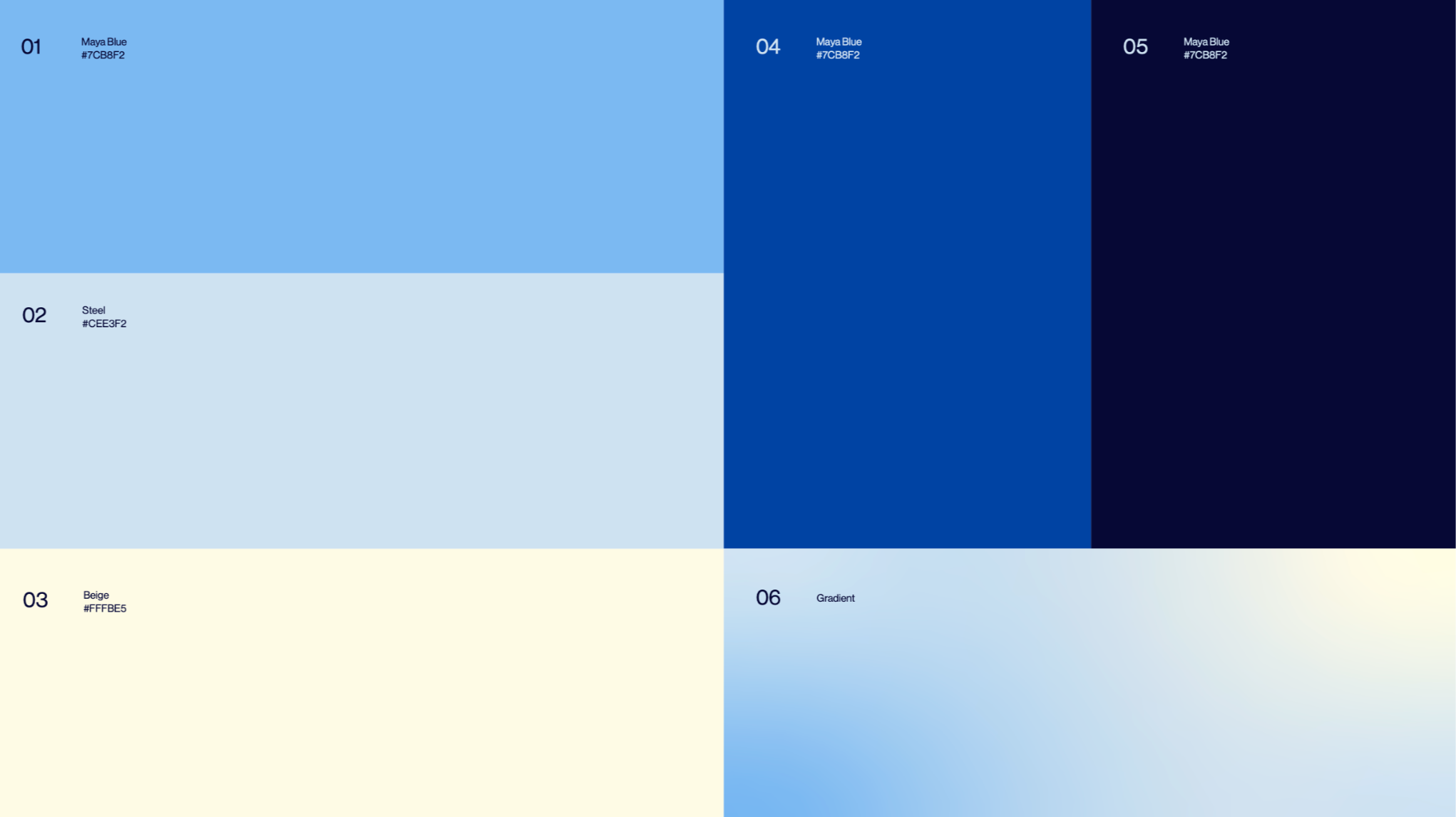
We chose a new color scheme, warm and fresh, breaking the intense tones of blue with a pale yellow that looked particularly good in print.
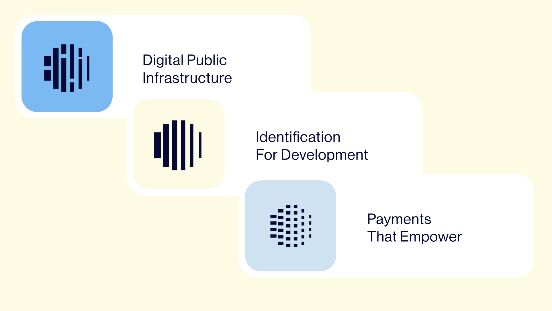
And redesigned each logo for every subprogram, in this case Identification for Development and Digital Government-to-Person Payments.
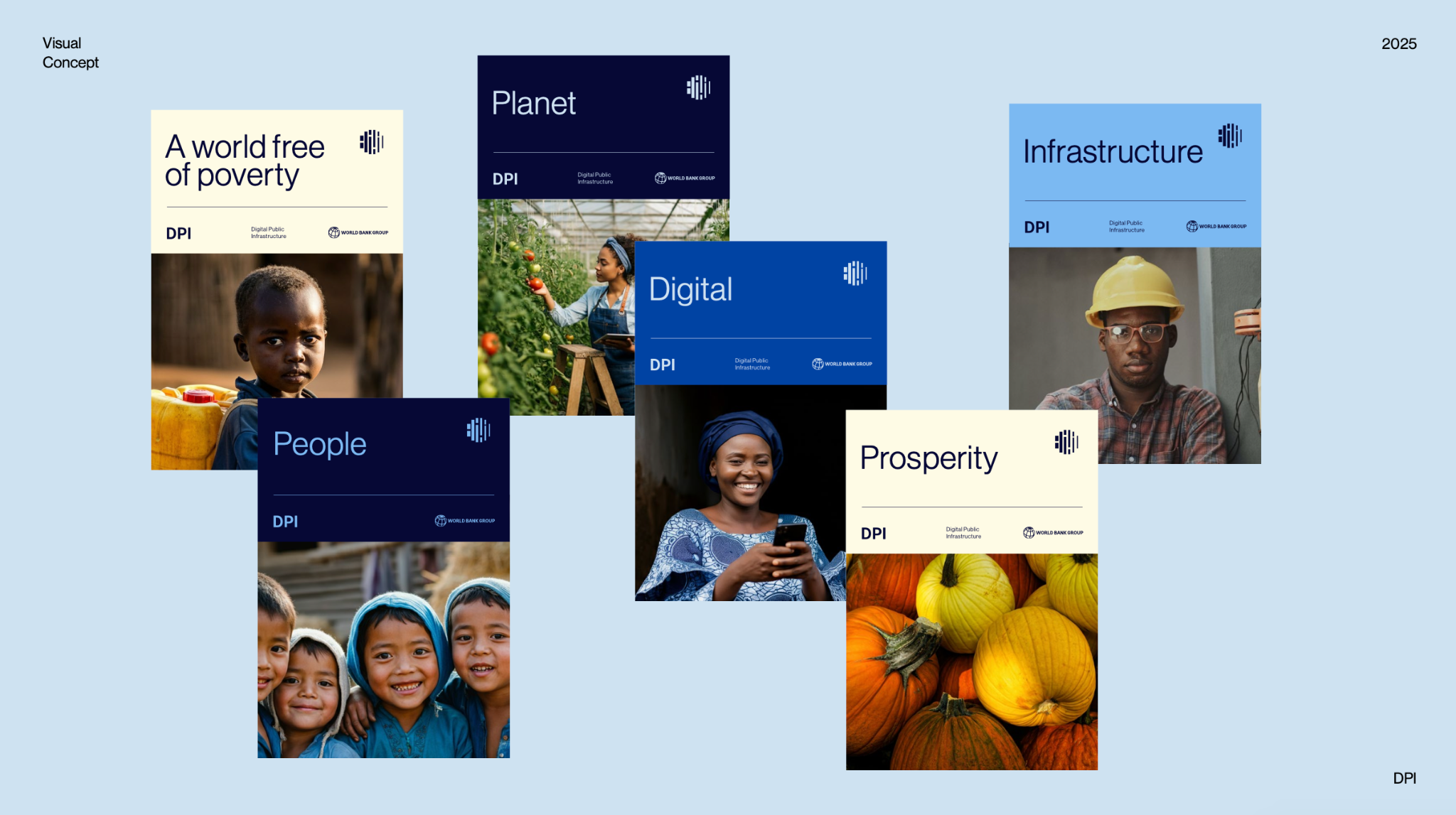
We also created templates and visual guidelines for several types of reports and other publications.
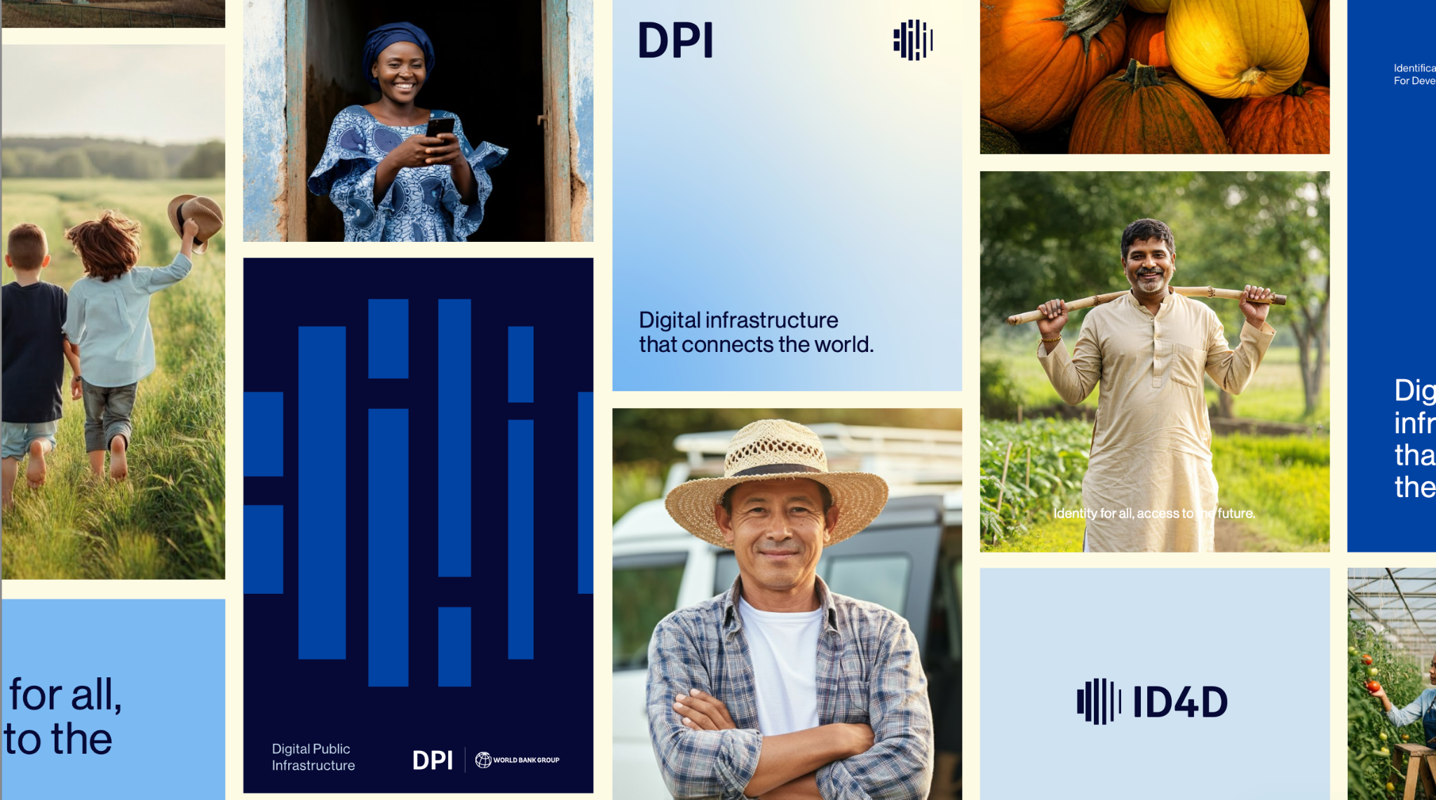
We worked on multiple assets, from business cards, to social media packages.
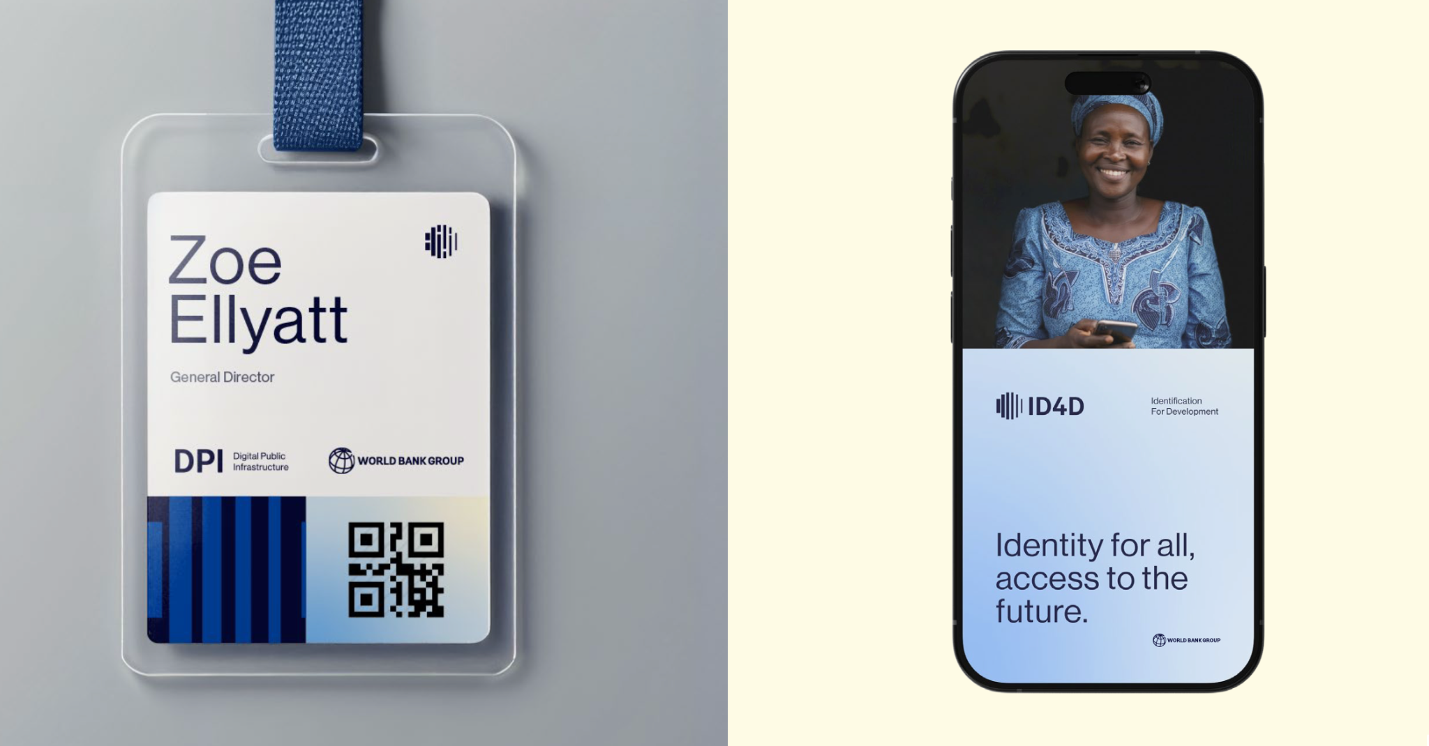
For events, we designed gadgets and digital business cards.
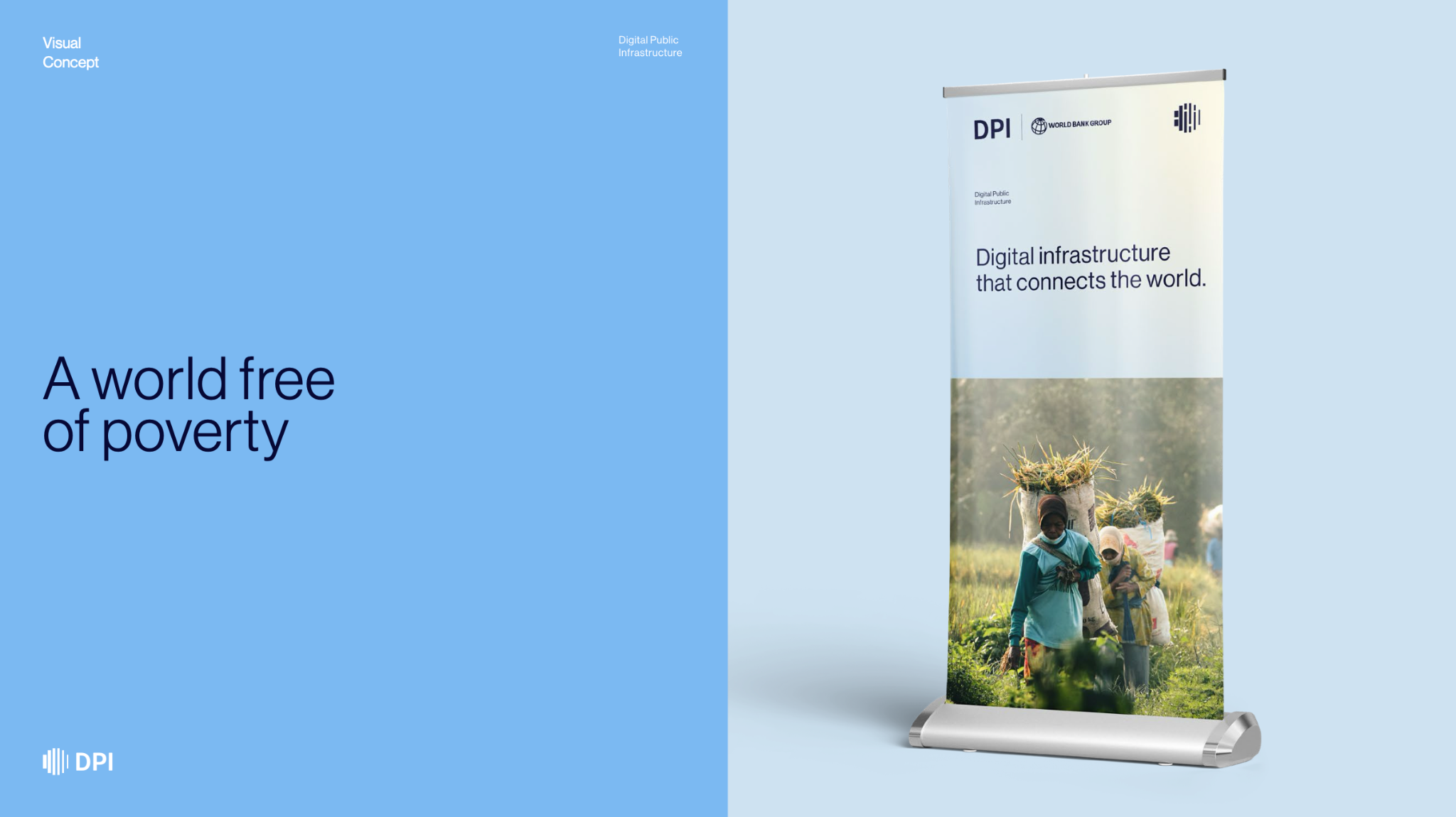
And last, but not least, we created banners for each topic and region it represented, under the new DPI logo.
My Process
To bring fresh perspective to an institution accustomed to playing it safe, I recruited a Cannes award-winning creative agency with roots in the fashion industry. Acting as account manager throughout, I ran the full engagement — briefing the team, managing deliverables, overseeing feedback cycles, and copy editing every asset. The process was deliberate and iterative, with every decision stress-tested across formats and signed off by stakeholders. The result: a cohesive visual system built to scale across regions, languages, and subprograms.